Traditionally more straitlaced and informative in nature, B2B brand advertising trends have turned towards creative visual and campaign designs last year.
MailChimp engaged in a round of gleeful weirdness in 2017, setting the bar high for creative B2B advertising. The email SaaS (i.e. “Software as a Service”) partnered with Droga5 (an independent advertising agency recently acquired by Accenture) to create a series of short films for with their “Did You Mean” campaign, designed to capture what people could accidentally type in when looking for MailChimp. In a similar fashion, HP took a relatively dry subject — enterprise cybersecurity — and encapsulated the dangers in a series of dramatic short films centered on an anthropomorphic characterization of cybersecurity threats, titled The Wolf.
While we think back on these impressive creatives and their lasting impact, we wanted to highlight some of the best creative B2B campaigns from more recent memory. Here’s what we found.
Monday.com
As Monday.com launched in the United States, they needed a creative way to stand out from the SaaS productivity apps already circulating the market. They found a one-two punch in a relatively unique 30 second video ad and a data-driven offline advertising campaign to go with it.

Source: DMNews.com
The video ad is comprised of two sections: one informative, and the other more creative. A short overview of the project management tool conveys easy organization and user-friendliness, along with the promise of a sense of satisfaction. Enter the creative portion, likening the feeling of using Monday.com to relatable daily victories — the satisfaction you feel taking the protective sticker off of an iPhone or throwing a wadded piece of paper into the trashcan on the first try.
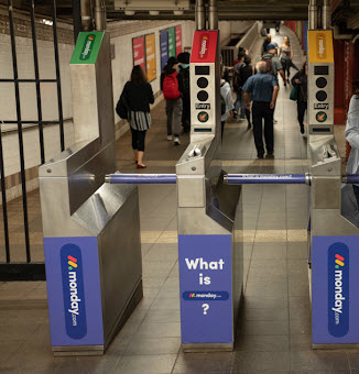
The OOH (i.e. “out-of-home”) campaign took the form of awareness ads, with billboards asking “What is Monday.com?” placed strategically around New York’s subway system and city streets.
The question was answered with both the video ad and secondary placements that created a cross-platform experience that created a dialogue outlining the tool’s many use cases. “Our brand identity has evolved as we’ve scaled, and when faced with the pressure of expressing everything in a single campaign, back to basics felt right for us,” writes Head of Communications Leah Walters. “The ads were colorful, humorous, and reflective of our true brand identity.”
In the past 12 months, Monday.com has run online ads on over 759 different sites and their spending peaked in Q4 of last year. Their spending also spanned many different ad formats, including display, mobile, video, email and native advertising.
Accenture
Following its acquisition of independent ad agency Droga5, the consulting giant is expanding its portfolio of initiatives with a strong creative bent.
“Accenture’s deeper push into advertising reflects the ad industry’s rapidly changing competitive landscape,” writes Sapna Maheshwari at The New York Times. “The company’s marketing arm has grown significantly in recent years as broader shifts in consumer behavior have reordered what advertising truly encompasses. In the past, it was about coming up with attention-grabbing ads. Now, it is also about providing broader consumer experiences.”
With the JailBlimp video for MailChimp in its portfolio, Droga5 has displayed a knack for creating innovative experiences that it can offer to Accenture clients.
Accenture, too, has maintained a standard of creativity in how it markets itself for nearly the past decade. In the past 12 months, Accenture has run ads across digital, print and TV, including placements in over 35 print publications and over 200 websites. This dedication to visibility is only half the battle, strong branding and creative materials need to stand up to the challenge of maintaining brand awareness.

Source: TheBrandGym.com
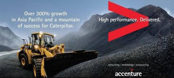
Accenture has built a visual brand around their consulting services, ranging from strategy to digital advertising. David Taylor writes that the visual branding has led to a memory structure over the past decade that is typically associated with direct to consumer brands. “Distinctiveness has been built through consistent use of the brand idea, and also the same logo and the little arrow that suggests progress and forward motion,” writes Taylor. “The campaign has also used the same basic executional structure, in landscape with the brand bottom right. It is interesting to observe how the campaign has been refreshed over time.”
Maintaining the same memory structure allows the brand to adapt the creative behind the logo across formats and target audiences.
UpWork
As a freelance platform, UpWork targets B2B companies with very specific needs in mind. Given that the platform’s freelancers offer a wide range of services and skills, UpWork needed to communicate its value no matter the niche.
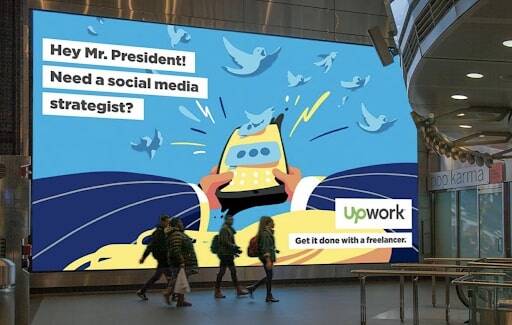
It accomplished the message with its “Hey World” campaign from early last year. The campaign “offers some cheeky ideas to show how entrepreneurs, small businesses, large enterprises, and every organization in between can get more projects done with a freelancer,” writes Courtney Buchanan in the platform’s blog announcement of the campaign by using fictitious scenarios such as helping The Rock in a 2020 presidential campaign and helping NASA get to Mars. With the video, UpWork presented itself as a one-stop-shop for freelancers to help organizations of all shapes and sizes meet their specific needs.

Source: UpWork
Designed to accommodate an evolving B2B advertising landscape, Hey World is a multi-channel campaign for which UpWork has integrated digital, OOH and video advertising to great effect. The company aimed to maintaining a constant foundation of consumer awareness via frequent exposure in billboards and digital video. Concurrently with these visibility efforts, UpWork rolled out a strategically restrained approach to digital ad buying. The company placed digital ads on relatively fewer websites, but priotitized high-volume domains like the Wall Street Journal and MarketWatch. Most recently, UpWork has ventured into television advertising, the first of which appeared in early 2019.
The witty ad materials and a focused emphasis on brand recognition for the campaign achieved a significant awareness foundation without sacrificing information or interest. The Hey World campaign is an excellent case study in the benefits of combining meticulous attention to B2B campaign strategy with creatively ambitious ad concepts.
Oracle
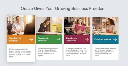
Similar to Accenture, Oracle has created a memory structure with its “freedom” campaign – which looks more like a website feature than an advertisement. The messaging is targeted at mid-market companies in the APAC region, with distinct landing pages focused on the various benefits of the software.

Source: Oracle
The landing pages serve as a central hub for Oracle’s many advertising efforts – in the past 12 months, Oracle has placed ads on over 1,000 websites, 30 print magazines and 10 TV networks.
In the above video discussing the campaign, VP of the Business Development Group, Cath Hodgson Croker said that the idea was “born out of a digital first strategy. Where we wanted to change it up a bit was to just talk to medium sized business, which is not Oracle’s previous customer base.” In tracking the campaign leading back to the “freedom” landing pages, the Oracle team saw 32 million impressions in their target audience.


